Six Swatches for a Town: Learning to See Colchester in Colour
Stand on Balkerne Hill at dusk and Colchester arranges itself into a palette. The Roman brick of the town wall goes a deep, dusty terracotta. The wet asphalt turns blue-black. Above the rooftops, the sky does that East Anglian thing — a soft, chalky grey that isn't quite blue and isn't quite white. Most of us walk past it. A local illustrator has spent the past two years stopping to mix it.
The project on the kitchen table
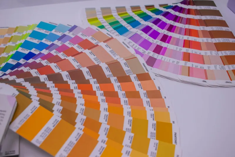
The maker behind the Colchester colour project — she has asked us not to print her name, since the whole thing still lives in a stack of sketchbooks beside the kettle — began by accident. She was drawing the Castle and couldn't get the brick right. "I was mixing a generic red," she says. "But Colchester brick isn't generic red. It's got chalk in it, and flint, and a hundred years of weather." So she started keeping a chart: a grid of small painted squares, each one matched to a specific surface in town. The Castle's reused Roman tile. A weathered fence post at the Hythe. The pale ochre render on a Dutch Quarter cottage. The river at low tide.
The charts are not scientific colour matching. They're records of noticing. Each swatch is labelled with a place, a date, the weather and a note — "after rain", "late afternoon", "north side, in shade". Over time, the pages start to read like a diary of the town.
Why Colchester is a good place to look
Towns with one dominant building material are easy to paint. Colchester isn't one of them. It's a layered place: Roman brick, Norman stone, Georgian brick, Victorian terracotta, 1960s concrete, and a river that changes colour by the hour. The result is a palette with more range than you'd expect from a town of its size.
The maker points to three ingredients. First, the brick — not a single red but a family of colours from orange-pink to a dark, almost purple brown, depending on age and which side of the building you're on. Second, the timber: the old quayside posts and shed boards at the Hythe, silvered by salt and sun. Third, the sky and water: the Colne is rarely blue. More often it's a greenish grey, a brownish olive, or a flat, reflective white when the clouds are low.
"You can tell a Colchester painting from a generic English town painting," she says, "because the greys are warmer. There's chalk in the light."
Six swatches to start with
You don't need a lab. The maker's advice is to begin with a handful of fixed points and return to them through the year.
- The Castle's Roman brick. Look at the flat, reused tiles in the keep walls, not the neat Victorian repairs. Match the dry face first, then the damp face after rain.
- The Balkerne Gate. A cooler, stonier grey-brown, with flecks of flint.
- Dutch Quarter render. A soft, chalky ochre — often dirtier at the bottom, where rain splashes.
- Hythe quay timber. Weathered silver-grey, with a warm brown underneath where the grain has opened.
- The Colne at East Bridge. Sample the water in shade, not the reflection of the sky. It's usually a dull olive-grey.
- Abbey Field sky. A wide, pale grey with a hint of warmth near the horizon.
Six is enough for a first chart. The maker suggests painting each one three times: once as a flat mixed colour, once as a wash over a pencil outline, and once as a dry-brush mark on rough paper. The differences teach you more than the matches do.
Keeping your own colour journal
A Colchester colour journal can be as simple as a pocket sketchbook, a pencil, a small watercolour set and a water brush. The maker's method is straightforward:
- Work in shade. Direct sun flattens colour. Stand with the surface in front of you and your paper in your own shadow, or come back on a cloudy day.
- Use a viewfinder. Cut a 3cm square in a piece of card and hold it against the wall, water or sky. It stops your eye from averaging everything out.
- Mix small, then smaller. Aim for a puddle the size of a 5p coin. Note the pigments you used — not just "brown" but "burnt sienna plus a touch of ultramarine".
- Let it dry. Watercolour dries lighter and duller. Paint a second swatch and compare it the next day before you adjust the mix.
- Write the conditions. Place, date, time, weather, wet or dry, sun or shade. The notes are half the value.
- Repeat. Go back to the same six places once a month. The chart becomes a calendar.
The maker's palette is deliberately limited: yellow ochre, burnt sienna, raw umber, ultramarine, a payne's grey and titanium white. "You can get most of Colchester out of that," she says. "The river needs a bit of green — I add a sap green, but only a little."
A town you can recognise by its colours
The point isn't to produce exhibition-ready paintings. It's to change the way you walk through town. Once you've tried to mix the exact colour of the wall outside the Mercury, or the exact grey of the Colne on a Tuesday in November, you start noticing the differences between one street and the next. The town becomes less of a backdrop and more of a subject.
The maker's charts now fill three sketchbooks. She has no plans to publish them. "They're not really for anyone else," she says. "They're proof that I looked."
That seems like a good reason to start one. All you need is a free afternoon, a few pigments and somewhere in Colchester that you've walked past a hundred times without quite seeing.