Paper, Pixels and the Private View: Decoding Colchester’s Exhibition Invitations
In Colchester, an exhibition often begins before the gallery lights are switched on. It begins as an A6 card taped to the inside of a café window, a square graphic posted on a studio’s Instagram, or a slightly crumpled flyer pressed into your hand outside a Saturday market. The private view invitation is the first room of the show. It tells you what kind of event you are being asked to step into, long before you meet the work itself.
The card in the café window
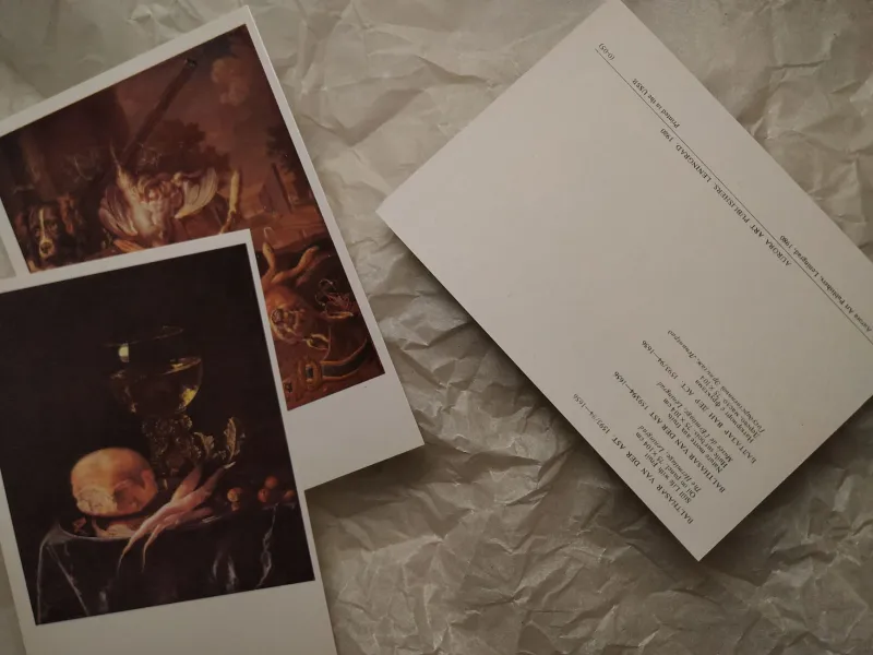
Walk through the town centre and you notice them: small cards Blu-Tacked beside noticeboards, stacked by the till in coffee shops, slipped under the glass at the counter of a independent shop. Some are professionally printed on thick stock. Others are photocopies with a hand-stamped title and a date added in biro. Both are doing the same job, and both are worth a second look.
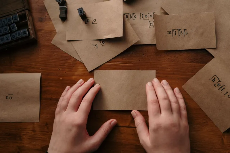
A hand-stamped card often signals a smaller, artist-led affair — a studio group show, a shared exhibition in a church hall, a project room above a pub. The imperfections are part of the invitation’s character. A crisp, offset-printed card with a logo and a private view time usually points to a gallery with a mailing list and a press schedule. Neither is better. They simply describe different scales of welcome.
Local designers I spoke to for this piece said the same thing in different ways: the invitation has to do a lot of work in a very small space. It has to say what the show is, where it is, when you can see it, and — crucially — whether you are the sort of person who is invited. In Colchester, that last point is often handled with a friendly line rather than a formal RSVP.
What the wording gives away
Read the wording closely and you can usually hear the tone of the event. “Private view” sounds slightly more formal than “opening night”, though in practice the two often mean the same thing. “All welcome” is a clear signal that you do not need to know the artist, own a black polo neck or arrive with a guest list. “RSVP essential” suggests a smaller room, a licensed bar, or a show that expects a particular crowd.
The details around the main text matter too. A card that lists opening hours, access information and a contact email is usually trying to be genuinely useful. A card with only a title and a date is asking you to trust the mystery. A card that includes a small map or a what3words reference is quietly saying: we know this venue is slightly tucked away, and we want you to find us.
Gallery volunteers in Colchester often mention that the invitation is where audience care starts. If the card is hard to read, the show can feel hard to enter. If the card is warm, clear and distributed beyond the usual art circles, the room tends to fill with a more mixed crowd.
Paper, pixels and the mailing list
Digital invitations have not replaced the printed card in Colchester — they have widened the circle. A gallery mailout can reach people who would never walk past a particular noticeboard, while a printed card can catch someone who has stopped scrolling for the afternoon. The best campaigns tend to use both: a printed object for texture and a digital version for speed.
Designers here talk about the pressure to make a graphic that works as a thumbnail and as a poster. That means bold type, a clear date and an image that still reads when it is the size of a postage stamp on a phone screen. It also means resisting the temptation to make the invitation look like every other exhibition graphic. The cards that stick in the mind often have a bit of grit: a photograph of the actual room, a scan of a sketchbook page, a colour that feels slightly off in a good way.
A short guide to reading an invitation
- Material and finish: Thick card and clean printing often point to a gallery with a budget and a schedule. Photocopies and stamps suggest a more hand-made, artist-led affair. Both are invitations to look.
- Typography: Formal serif type can signal a traditional or historical show. Loose, hand-drawn lettering often suggests something more experimental or community-focused.
- Wording: “All welcome” is your green light. “RSVP” means check before you go. “Private view” and “opening” are usually interchangeable in practice, but the former can sound a little more dressed-up.
- Distribution: A card in a café window is trying to reach passers-by. A mailout is speaking to people already on the list. A card that appears in both places is usually making a genuine effort to broaden the room.
- Extra details: Access notes, opening hours and a contact email are signs that the organisers have thought about the visitor, not just the artwork.
As Colchester moves through the final weeks of 2026, with winter shows and studio events filling the calendar, the invitation remains a small but meaningful piece of design. It is ephemeral, practical and quietly creative. The next time you see a card in a café window, read it twice: once for the details, and once for the tone. It will tell you a surprising amount about the room waiting behind the door.